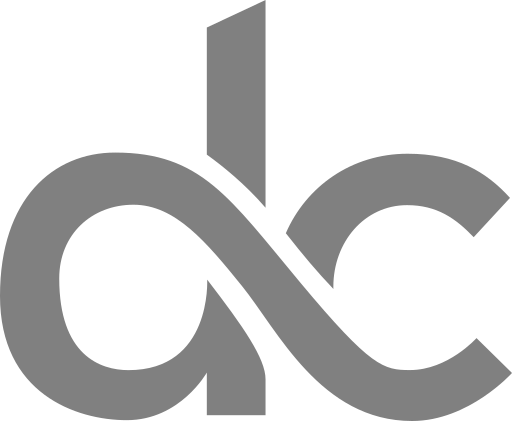
We Have a New Logo!
Prologue
I’ve been busy for the past month. Impending project milestones required some additional effort and when you’re new to an organization you try to show that you’re worth your salt. Also, there are lots of new things to learn at work when you start out. I had not forgotten about my blog, I have a new logo, one personal post and one tutorial in the works to be released in the coming weeks. Fortnightly posts seem like a good frequency for blog posts, though it depends on how much content I’m able to churn out. Long story short, extended periods of inactivity on my blog means either I’m dead or no time for blogging.
Why The New Logo?

The old logo was designed by me way back during my undergraduate days in the year 2014. Back then I had sketched out a few designs, picked one, and ran with it. Armed with my measly experience in Adobe Illustrator gained from Youtube tutorials I set out to bring my design to life. The result was my old logo. With the relaunch of my blog, I thought maybe it was time to hash out a new logo. Something that looks modern and screams simplicity.
Design Idea and Process?
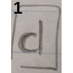
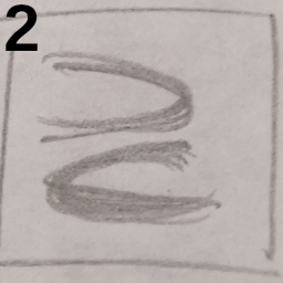
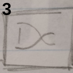
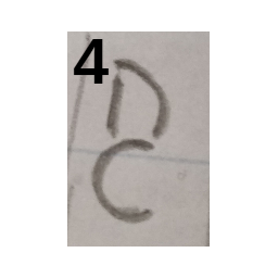
I don’t think of myself as an artist in the conventional sense, though I’m thinking of learning how to play the flute. Between my work breaks, I sketched whatever design or idea came to my mind. You can see some of my initial concepts below.
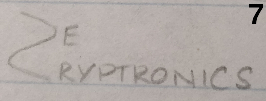
Out of about 10 designs I picked six designs, numbered 1-5 and 7. Now that I had some money in my pocket, I thought not to waste time and effort in graphics design when I could hire a professional for a couple of bucks. I finalized a designer who designs logos on Fiverr for $10. Way to go cheap!
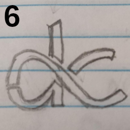
I showed my sketches to the designer and following a couple of mock-up’s I thought that a logo needs some substance apart from good looks, a hidden meaning like logos of Amazon, FedEx, or Toyota. Being an electronics engineer, the VAIO Corporation’s logo came to mind. A logo that’s modern, simple, and has a hidden meaning. This led me to sketch out logo #6 which was refined by the designer and is the face of my blog now.
Hidden Meaning in dC’s Logo
The new logo is a mashup of elements from digital (1 and 0) and analog (a sine wave) electronics just like VAIO's logo.
With 1 as the stem and 0 as the bulb, the character d is formed. A sine wave and the infinity (∞) symbol is baked into the design formed by an interplay between the d and c characters.
| 1,0 | Digital Electronics | The central theme of this blog |
| Sine Wave | Analog Electronics | An interface to the real world |
| ∞ | Dual Meaning | The many stories from a person’s life or the infinite possibilities electronics have given to mankind. |


